year2025
industryentertainment
- events
- brand

the challenge
Rembrandt van Wine, a new Amsterdam-based paint-and-sip concept, were looking to create a distinctive brand identity that would capture the creativity, social atmosphere and immersive glow-in-the-dark painting experience at the heart of their events. Designed with future expansion across Europe in mind, the identity needed to be memorable, flexible and easily applied across a range of digital and physical touchpoints. Deliverables included the core visual identity, digital marketing assets and printed materials for use throughout their event spaces.


process
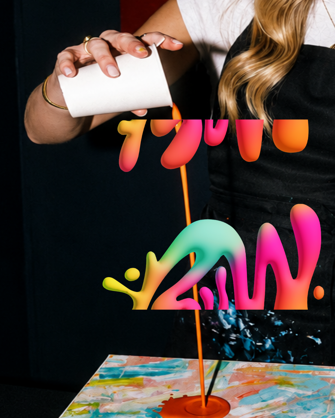
The visual identity began with the experience itself. I explored the sensory elements participants would encounter - expressive paint strokes, splashes of colour and the vibrant neon atmosphere of the darkened studio. These abstract forms became the foundation of the identity, gradually evolving into illustrations that captured the connections formed through shared creativity.
strategy
The identity was designed to inspire people to step outside their comfort zone and embrace creativity, regardless of their artistic experience. By creating a brand that felt playful, expressive and welcoming, the aim was to lower the barrier to participation, encourage people to experiment and connect with others, and create a memorable experience that kept them coming back for future events.

delivery
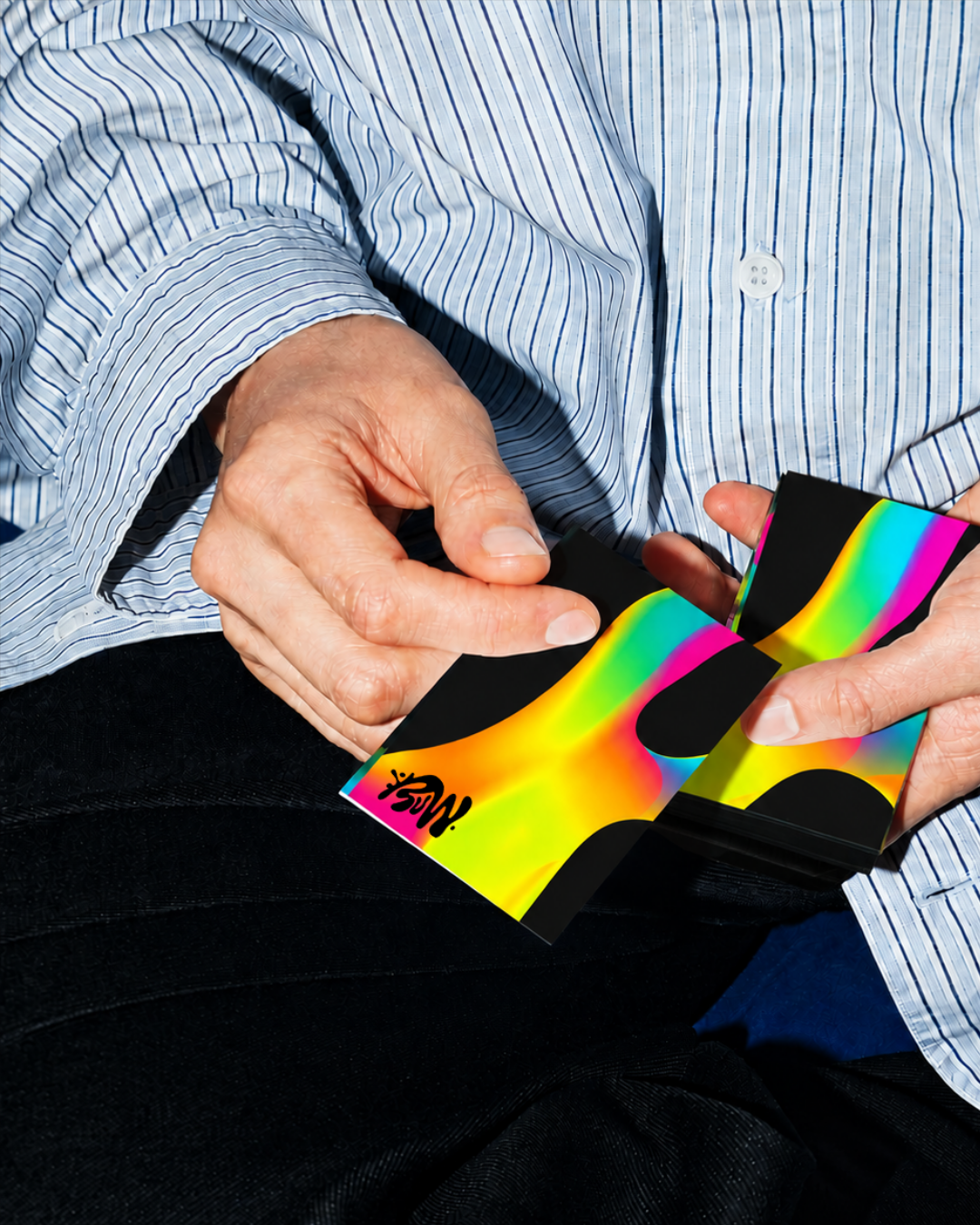
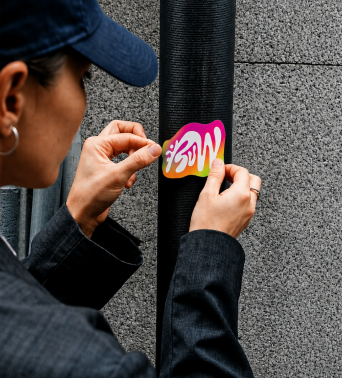
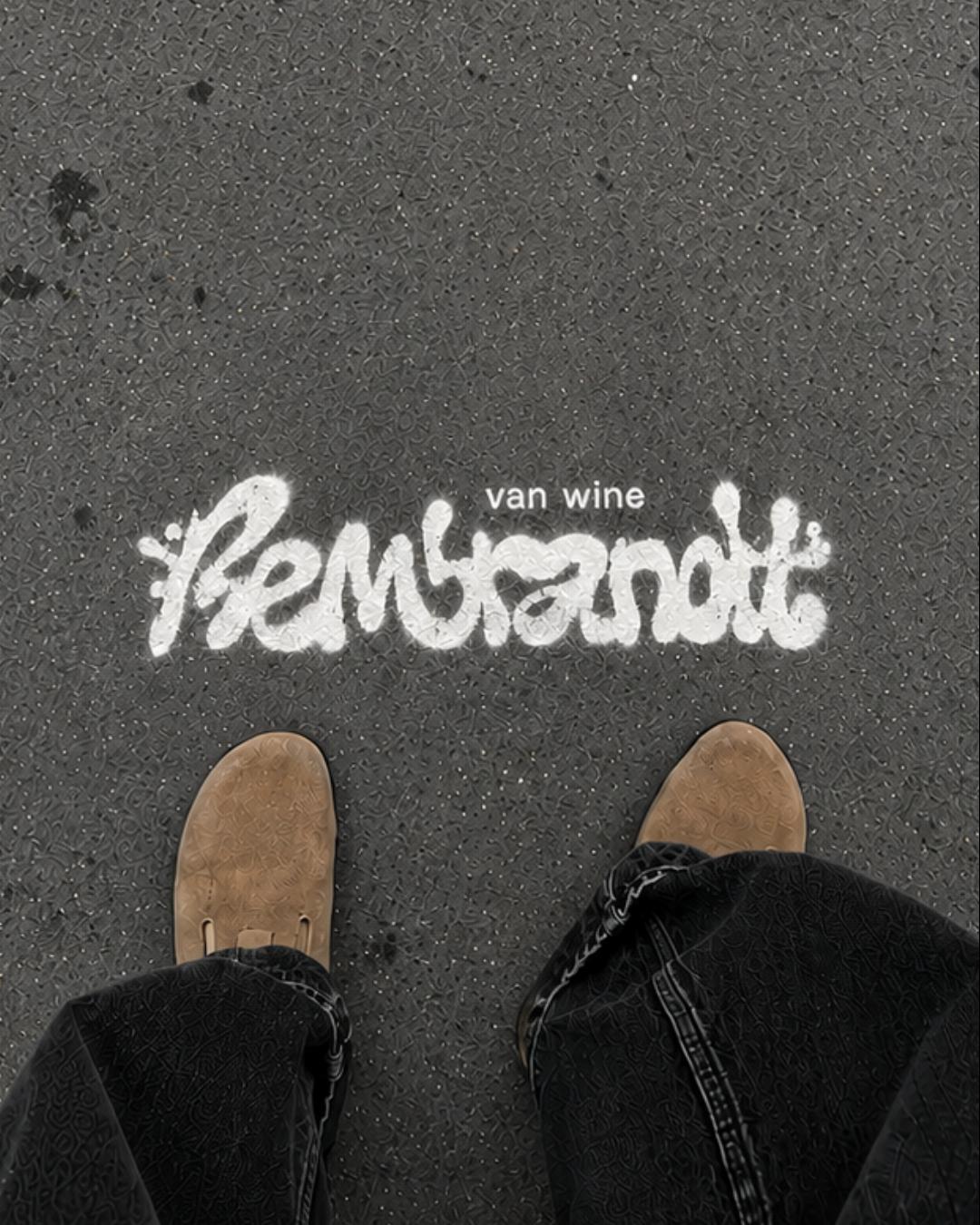
The visual identity was built around expressive, organic brushstrokes and fluid shapes that reflect the spontaneity of painting itself. A vibrant colour palette inspired by fluorescent paints and UV lighting brings energy to the brand, while bold typography and simplified forms ensure the identity remains modern, memorable and highly adaptable. The system was designed to work seamlessly across both digital and physical environments. Event signage, promotional materials, stickers and branded assets create a cohesive experience from first interaction through to the event itself. The apparel collection was designed as an extension of the brand, featuring hand-drawn illustrations inspired by the key elements of the experience, from paintbrushes, palettes and abstract brushstrokes to wine, music and artistic expression. These playful sketches capture the atmosphere of a Rembrandt van Wine event, allowing customers to take home a wearable reminder of the experience while reinforcing the brand's creative and community-driven identity. By balancing expressive, organic forms with a clean, contemporary aesthetic, the identity feels authentic, memorable and ready to scale across new locations.