year2025
industrybeauty
- packaging
- brand
the challenge
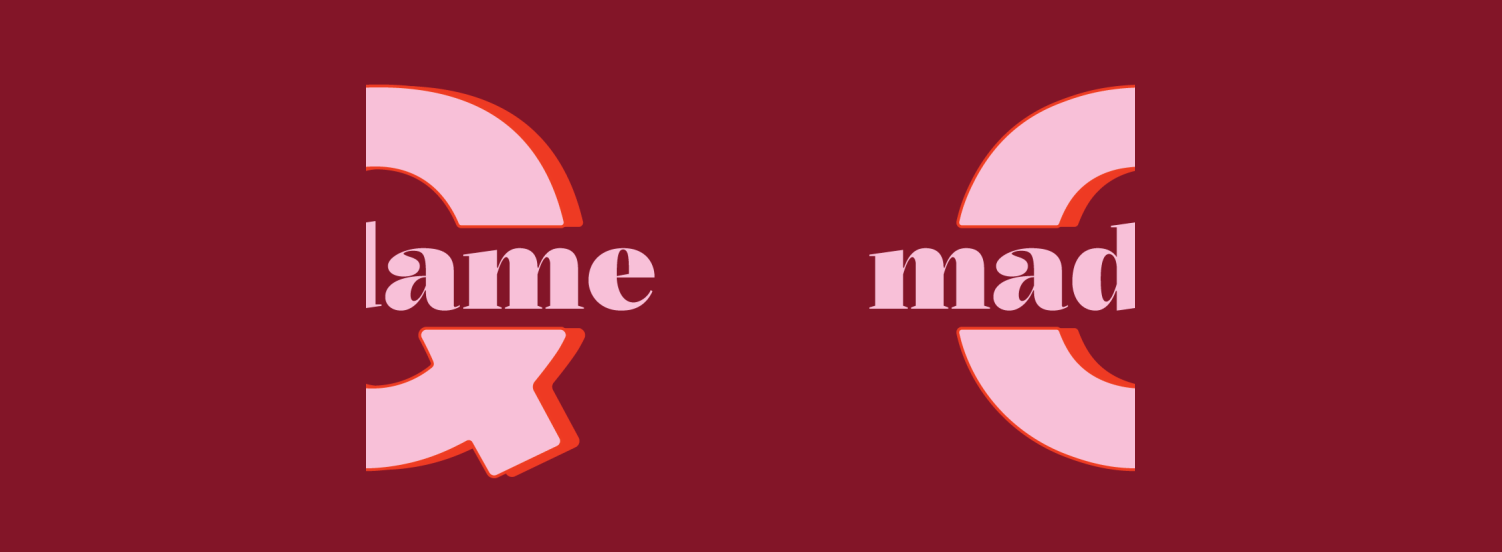
Madame Q, a new cosmetics start-up specialising in dipping powder nail systems, briefed us to create a brand that challenged traditional beauty standards while making salon-quality nails more accessible from home. The identity needed to feel premium yet approachable, balancing luxury with a playful personality that encouraged creativity, self-expression and community. Alongside a comprehensive set of brand guidelines, the project included the design of the full packaging range, from the starter kit and product labels to supporting print and digital assets, creating a cohesive brand experience across every customer touchpoint.

process
The creative process began by exploring the expressive nature of the product itself. Fluid shapes, vibrant colour palettes and layered compositions were developed to reflect the freedom and playfulness of experimentation, while a clean, contemporary design language ensured the identity felt modern and relevant. These visual elements were refined into a cohesive identity system, ensuring the branding remained impactful across packaging, marketing materials and digital applications while maintaining clarity and consistency.
strategy
The brand was created to challenge expectations within the beauty industry by celebrating self-expression, experimentation and individuality. Rather than positioning the product as another cosmetic, the identity was designed to encourage creativity and confidence, inviting customers to play with colour and create looks that reflected their own personality. The visual language needed to feel bold and contemporary while remaining distinctive across packaging, digital and retail touchpoints.
delivery
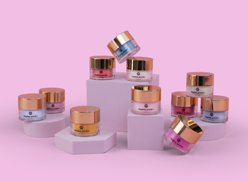
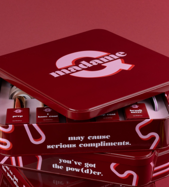
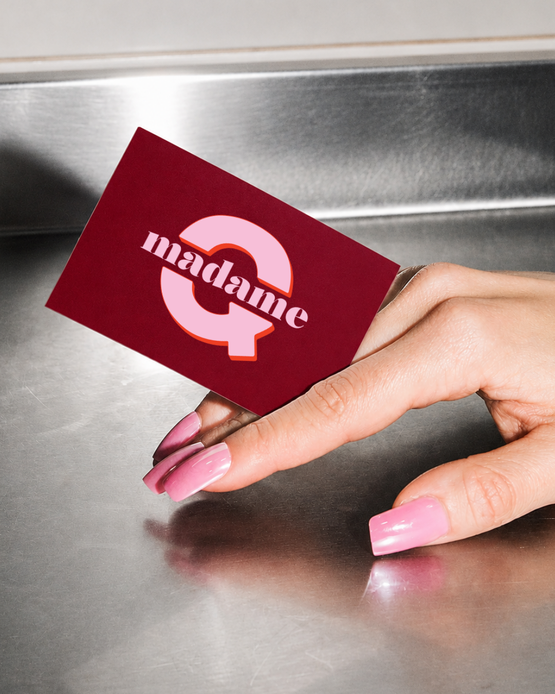
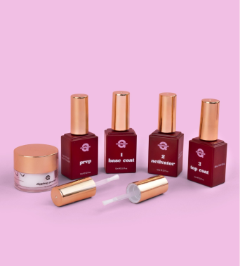
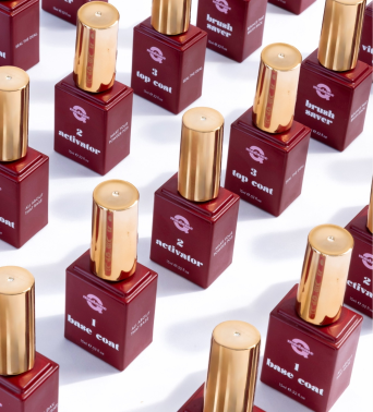
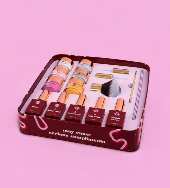
A custom wordmark, hand-drawn brand shapes and a rich colour palette create a distinctive visual language that balances premium cosmetics with a playful personality. Throughout the identity, witty copywriting reinforces the brand's confident tone while encouraging customers to embrace creativity on their own terms. Packaging was treated as an extension of the brand rather than simply a container for the product. From the starter kit to the individual bottles and dipping powders, each item was designed to feel part of a unified collection through consistent typography, colour, copywriting and graphic elements. Playful taglines add personality to every product, while a clear visual hierarchy keeps the application process intuitive. Finishing touches, including the printed interior of the starter kit, elevate the unboxing experience and reinforce the premium positioning of the brand.